Session 05
ONCE YOU HAVE ALREADY WORKED WITH DSP FILES LAST WEEK, THIS WEEK WE CONTINUE WITH DSP TUTORIAL!!!
I have uploaded DSP05_Aufgabenstellung and DSP_Uebung_02.
Also all WAV audio files relating the tutorial.
First, you should copy all these new files into your work repository.
- Open the terminal in Jupyter
- Type:
cd ~/work/tutorial_it2
- Type:
git pull
- Once you moved all your files, go to Praktikum_5 folder, choose all new WAV files and move to
/work/ThinkDSP/codedirectory
All new files are added to your work repository. Open PDFs folder and start working with new files!
Good luck!
Exercise 2 DSP
The second exercise to DSP the application of FIR filters and their interpretation is clarified. The moving average is also considered as a FIR filter and its frequency response is investigated. Basic functions of the DSP are explained, such as convolution and impulse response. Other frequently used functions, such as correlation, are applied to signals, e.g. to determine time differences or to test signals for similarity.
from __future__ import print_function, division

%matplotlib inline

import matplotlib.pyplot as plt
import thinkdsp
import thinkplot

from ipywidgets import interact, interactive, fixed
import ipywidgets as widgets
from IPython.display import display
The above modules are used by thinkDSP. The following are necessary for the FIR filter, e.g. cross correlation:
from scipy import signal
import numpy as np
FIR filter design
bands = (0, 100, 200, 350, 400, 500)
fs = 1000.0
# Hz

desired = (1, 1, 1, 0, 0, 0)
The first step is to define the requirements for a FIR filter with a low-pass characteristic.
Two arrays must be created with the same number of elements. Each frequency in bands corresponds to a gain value in desired. Thus a low pass filter is generated, which should let the signal through at 0Hz, 100Hz and 200Hz and completely attenuate it at 350 Hz.
The sampling frequency fs is set to 1kHz. The firwin2 function of scipy is used to calculate the filter coefficients. Here the order of the filter must also be specified. The order is equal to the number of filter coefficients to be generated and influences the steepness of the filter. The order must always be odd, e.g. 21:
fir_firwin2 = signal.firwin2(21, bands, desired, fs=fs)
The filter coefficients are output:
print(fir_firwin2)
We get:
[ 5.31159673e-04 -1.08391672e-04 -9.78017348e-04 2.22098138e-04
-1.84070513e-03 7.30839817e-03 1.60436718e-02 -5.34342304e-02
-3.85511856e-02 2.95992306e-01 5.50130208e-01 2.95992306e-01
-3.85511856e-02 -5.34342304e-02 1.60436718e-02 7.30839817e-03
-1.84070513e-03 2.22098138e-04 -9.78017348e-04 -1.08391672e-04
5.31159673e-04]
A very simple, badly designed FIR filter is a floating mean value. It can easily be generated as an array with the length of the values of identical filter coefficients used for averaging. Each filter coefficient then has the value 1/Number_of_the_values_used_for_averaging (length_gleimi).
The number of values used influences the cut-off frequency!
Here are the coefficients for a floating mean value:
length_gleimi = 5
fir_gleimi = np.empty([length_gleimi])

fir_gleimi.fill(1.0/length_gleimi)
print(fir_gleimi)
We get:
[0.2 0.2 0.2 0.2 0.2]
Frequency response
After generating the two FIR filters, the frequency response corresponding to the characteristics of the filter is calculated. The freqz function of the scipy module generates two arrays, the frequency and the response of the filter. However, the frequency is in rad/sample and must therefore be converted for display. The response of the filter is a complex number and is represented as an amount:
w1, h1 = signal.freqz(fir_firwin2)
w2, h2 = signal.freqz(fir_gleimi)
Now both frequency curves can be displayed. For this purpose matplotlib is used:
plt.plot(0.5*fs*w1/np.pi, np.abs(h1), 'b-')
plt.plot(0.5*fs*w2/np.pi, np.abs(h2), 'g-')
plt.xlim(0, 0.5*fs)
plt.title("Lowpass Filter Frequency Response")
plt.xlabel('Frequency [Hz]')
plt.grid()
We get:
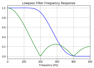
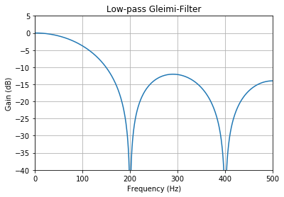
The inadequate damping at higher frequencies, which occurs periodically, is clearly visible in the moving average value. The moving average attenuates up to 200Hz with an almost linear characteristic curve, but then a bandpass-like characteristic occurs in the frequency band between 200Hz and 400Hz. The 21st order FIR filter has no such characteristic, but has a rather small gradient in the stop band, which can be steeper by increasing the order. The attenuation or amplification of signals is often given in decibels. The following function allows a comfortable representation of the frequency response of designed filters:
def plot_response(fs, w, h, title):
    fig = plt.figure()
    ax = fig.add_subplot(111)
    ax.plot(0.5*fs*w/np.pi, 20*np.log10(np.abs(h)))
    ax.set_ylim(-40, 5)
    ax.set_xlim(0, 0.5*fs)
    ax.grid(True)
    ax.set_xlabel('Frequency (Hz)')
    ax.set_ylabel('Gain (dB)')
    ax.set_title(title)
plot_response(fs, w2, h2, "Low-pass Gleimi-Filter")
We get:
Impulse response
But how is the frequency response of a filter generated? You could generate a signal with a known frequency, which you can vary continuously. Thus, the response of the filter can be determined by changing the frequency over the entire filter range. This can be done with a chirp. In practice this is feasible, but theoretically the impulse response can also be used. A single pulse is generated for this purpose:
impulse = np.zeros(1000)
impulse[0] = 1
wave = thinkdsp.Wave(impulse, framerate=1000)
#print(wave.ys)

thinkplot.config(xlabel='Time (s)', xlim=[-0.05, 1], ylim=[0, 1.05])
wave.plot()
We get:

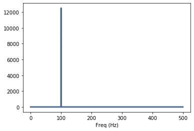
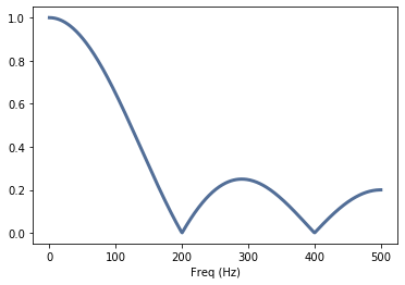
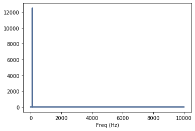
If this impulse is transformed into the frequency range, it becomes apparent why this function is particularly useful for the characterization of filters - and almost all technical systems: it contains all frequencies up to the Nyquista frequency:
spectrum = wave.make_spectrum()
thinkplot.config(xlabel='Freq (Hz)')
spectrum.plot()
We get:
A filter corresponds to the convolution of the input signal with the filter function. So we can convolute our impulse function with e.g. the floating mean value filter and get a “washed-out” impulse with a certain duration:
new_wave = wave.convolve(fir_gleimi)
thinkplot.config(xlabel='Time (s)', xlim=[0, 0.01], ylim=[0, 0.2])
new_wave.plot()
We get:

If this function is transformed into the frequency domain, you get the frequency response of the mean filter:
spectrum_gleimi = new_wave.make_spectrum()
thinkplot.config(xlabel='Freq (Hz)')
spectrum_gleimi.plot()
We get:
Correlation methods
Autocorrelation can be used to assess the periodicity or the signal content. It corresponds to a convolution of the signal with itself. Two signals are generated: an uncorrelated noise that has no period and a sinusoidal signal that resembles itself:
thinkdsp.random_seed(42)
noise_sig = thinkdsp.UncorrelatedGaussianNoise(amp=0.2)
noise_wave = noise_sig.make_wave()

noise_wave.normalize()
N = len(noise_wave)
corrs2 = np.correlate(noise_wave.ys, noise_wave.ys, mode='same')
lags = np.arange(-N//2, N//2)
thinkplot.plot(lags, corrs2)
thinkplot.config(xlabel='Lag', ylabel='Auto Correlation', xlim=[-N//2, N//2])
We get:
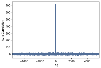
One can clearly see that this signal only has a high correlation (similarity) if it is not shifted in time (Lag = 0). As soon as the signal is shifted e.g. only by one sample, the correlation goes back to ~0. So the signal is uncorrelated:
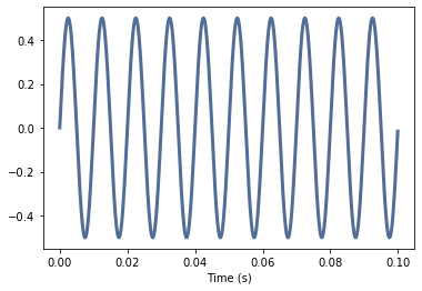
sin_sig = thinkdsp.SinSignal(freq=100.0, amp=0.5, offset=0)
sin_wave = sin_sig.make_wave(duration=0.1, framerate=2000)

sin_wave.normalize()
N = len(sin_wave)
corrs2 = np.correlate(sin_wave.ys, sin_wave.ys, mode='same')
lags = np.arange(-N//2, N//2)
thinkplot.plot(lags, corrs2)
thinkplot.config(xlabel='Lag', ylabel='Auto Correlation', xlim=[-N//2, N//2])
We get:
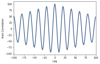
The similarity is clearly visible with the sine signal: the sine is also most similar with a lag=0, but after a shift of one period, the correlation is approximately maximum with time-limited signals, or equal to 1.0 with infinite time series. The autocorrelation function corresponds to the cosine function. The time difference between two signals can be determined with the cross-correlation, even of highly noisy signals with a low similarity:
def make_sine_with_noise(offset):
# Generate a sinwave with SNR of 1
    noise_signal = thinkdsp.UncorrelatedGaussianNoise(amp=0.5)
    signal = thinkdsp.SinSignal(freq=500, offset=offset)
    mix = signal + noise_signal
    wave = mix.make_wave(duration=0.5, framerate=10000)
    return wave

def gen_waves(offset):
# Generate two sinwaves with a defined phase offset
    wave1 = make_sine_with_noise(offset=0)
    wave2 = make_sine_with_noise(offset=-offset)
    wave1.normalize()
    wave2.normalize()
    return wave1.segment(duration=0.01), wave2.segment(duration=0.01)

wave1, wave2 = gen_waves(1.57)
# Generate two waves with pi/2 offset
wave1.plot()
wave2.plot()
thinkplot.config(xlabel='Time (s)', ylim=[-1.05, 1.05])
We get:
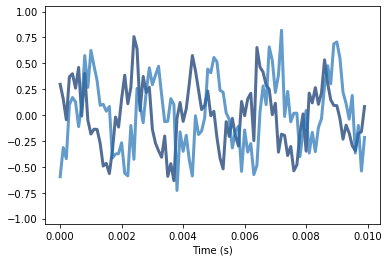
The signals do not look particularly correlated. If you use the cross correlation, however, you can clearly see that the signals are similar and that about 5 samples are separated:
N = len(wave1)
corrs2 = np.correlate(wave1.ys, wave2.ys, mode='same')
lags = np.arange(-N//2, N//2)
thinkplot.plot(lags, corrs2)
thinkplot.config(xlabel='Lag', ylabel='Cross Correlation', xlim=[-N//2, N//2])
We get:
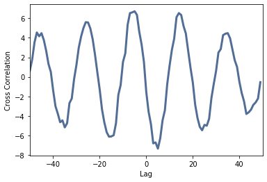
The single values of the correlation are available in the array corrs2 and can be used e.g. for the determination of the runtime difference. Numpy provides functions with which the maximum of the array in a certain range can be determined. Since the zero point (lay=0) lies in the middle of the array len(corrs)/2, the following code is used to search for the middle of the array. From the center, the maximum is searched in the range from -10 samples to 0:
corr_length = len(corrs2)
low, high = -20+int(corr_length/2), int(corr_length/2)
lag = np.array(corrs2[low:high]).argmax() + low
laghigh = lag-corr_length/2
print("Highest Peak:",laghigh)
We get:
Highest Peak: -5.0
periodhigh = laghigh / wave1.framerate
print(periodhigh, "s")
We get:
-0.0005 s
periode_theo_500 = 1.0/500.0
print(periode_theo_500/4.0)
We get:
0.0005
The time difference between the two signals is -0.5ms, which corresponds to the theoretical value of a sine signal of 500Hz with an offset of Pi/2.
Exercises
Task assignment
In this tutorial, the learned knowledge will be applied to signals in order to solve the following tasks:
- Analysis of a signal consisting of two frequencies. Here the file DSP_PT2_Wave01.wav is examined. It must be loaded and then filtered. The frequencies of the signals involved are to be determined and both signals to be reconstructed individually.
- Analysis of a signal consisting of a variety of frequencies and noise. For this the file DSP_PT2_Wave02.wav is examined. The signal consists of a multiple of signals with different frequencies and amplitudes. Please determine the individual frequencies as precisely as possible and then generate the individual filtered signals with as little noise as possible.
- Convolution of different functions. Please generate the following three signal types:
- a square pulse or a square signal with half a period,
- a sawtooth pulse or a sawtooth signal with half a period,
- a half-period sinusoidal signal. Then, please perform all possible convolution between the generated signals - including the convolution of the signal with itself. Display the signals and the results.
- Analysis of several highly noisy signals for correlatable signal content. A total of four signals must be analyzed (DSP_PT2_Wave03.wav to DSP_PT2_Wave06.wav). Use autocorrelation to determine whether these are periodic signals with information content and which (main) frequency the signals have.
- Determination of the transit time difference of two strongly noisy signals with the cross correlation The transit time difference between the two signals “DSP_PT2_Wave07.wav” and “DSP_PT2_Wave08.wav” shall be determined. The result should be given in milliseconds.
YOU CAN DOWNLOAD THE SOLUTIONS OF THESE EXERCISES DIRECTLY FROM GITLAB, FOLDER PRAKTIKUM_5/PDFs/Aufabe_Loesung_Complete
Some hints:
- Use the routines and examples from Exercise 2 DSP
- The files have different sample rates and lengths (framerate and duration)
- There are usually a lot of samples that make it difficult to display. Here you can create sections of the wave file with the segment function of the wave object. Description and sample code below
- The auxiliary function plot_response for displaying the frequency response can be found in the appendix
- The following modules must be imported:
from __future__ import print_function, division

%matplotlib inline

import matplotlib.pyplot as plt
import thinkdsp
import thinkplot

from ipywidgets import interact, interactive, fixed
import ipywidgets as widgets
from IPython.display import display

from scipy import signal
import numpy as np
The ys attribute is a NumPy array that contains the values from the signal. The interval between samples is the inverse of the framerate.
normalize scales a wave so the range doesn’t exceed -1 to 1.
apodize tapers the beginning and end of the wave so it doesn’t click when you play it.
Signal objects that represent periodic signals have a period attribute.
Wave provides segment, which creates a new wave.
sin_sig = thinkdsp.SinSignal(freq=100.0, amp=0.5, offset=0)
sin_wave = sin_sig.make_wave(duration=2.5, framerate=20000)

thinkplot.config(xlabel='Time (s)')
sin_wave.plot()
# Display with many samples, duration is too high (2→ 5s)
We get:

Duration reduced to 0.1s, now it is better visible:
segment = sin_wave.segment(duration=0.1)

thinkplot.config(xlabel='Time (s)')
segment.plot()
We get:
Poor visibility of the lower frequencies:
def plot_response(fs, w, h, title):
# Utility function to plot response functions
    fig = plt.figure()
    ax = fig.add_subplot(111)
    ax.plot(0.5*fs*w/np.pi, 20*np.log10(np.abs(h)))
    ax.set_ylim(-40, 5)
    ax.set_xlim(0, 0.5*fs)
    ax.grid(True)
    ax.set_xlabel('Frequency (Hz)')
    ax.set_ylabel('Gain (dB)')
    ax.set_title(title)

spec = sin_wave.make_spectrum()
thinkplot.config(xlabel='Freq (Hz)')
spec.plot()
We get:
Better visibility of the lower frequencies:
thinkplot.config(xlabel='Freq (Hz)')
spec.plot(high=500)
We get: