Session 04
Jupyter
The Jupyter Notebook is an open-source application that allows you to create and share documents that contain live code, equations, visualizations and text. Uses include: data cleaning and transformation, numerical simulation, statistical modeling, data visualization, machine learning, and much more.
During this course, we study DSP tutorial using Jupyter Notebook.
In order to run the Jupyter Notebook on your PC, please follow these steps:
- Get access to Jupyter Notebook through https://jupyter.bigdata.fh-aachen.de/ (access in FH Aachen VPN only). You should sign in with your FH account
- Click on
Newbutton on the top right side and chooseTerminal - Go into your already existing
workdirectory (files in other places might get lost or deleted)
cd ~/work
- Clone the ThinkDSP Python-Module from its github repository.
git clone https://github.com/AllenDowney/ThinkDSP
- Clone the Tutorial repository from its gitlab repository.
git clone https://git.fh-aachen.de/group-uno/tutorial_it2/
- Copy WAV files into ThinkDSP/code subfolder.
cp ~/work/tutorial_it2/Praktikum_5/*.wav ~/work/ThinkDSP/code/
- Go in
~/work/ThinkDSP/code/folder on Jupyter - Click on the top right on
New --> Python 3 - Start working on the PDFs inside
~/work/tutorial_it2/Praktikum_5/PDFsfolder
(optional) Installation of Jupyter Notebook
I recommend using the Anaconda Distribution, which includes the Jupyter Notebook, and other commonly used packages for scientific computing and data science.
First, download Anaconda. I recommend downloading Anaconda’s latest Python 3 version through this website: https://www.anaconda.com/distribution/:
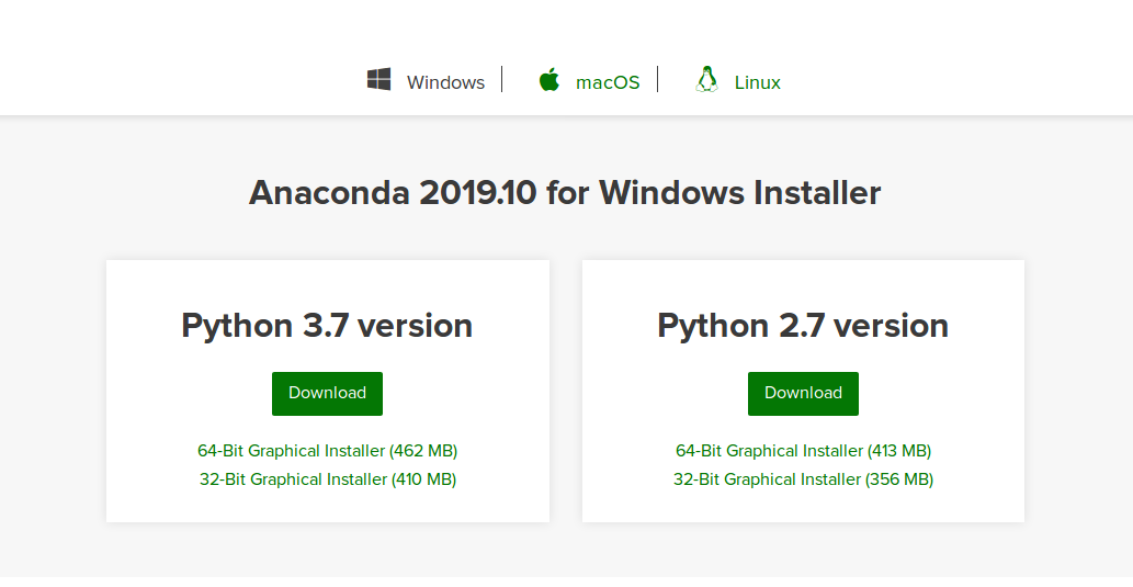
Choose according your operating system Windows or macOS and download Python 3.7 version.
Installing on Windows
Once you downloaded, go though these steps:
- Double click the installer to launch. If you encounter issues during installation, temporarily disable your anti-virus software during install, then re-enable it after the installation concludes.
- Click Next.
- Read the licensing terms and click “I Agree”.
- Select an install for “Just Me” and click next.
- Select a destination folder to install Anaconda and click the Next button:
- Choose whether to add Anaconda to your PATH environment variable. I recommend not adding Anaconda to the PATH environment variable, since this can interfere with other software. Instead, use Anaconda software by opening Anaconda Navigator or the Anaconda Prompt from the Start Menu
- Choose whether to register Anaconda as your default Python.
- Click the Install button.
- Click the Next button:
- After a successful installation you will see the “Thanks for installing Anaconda” dialog box:
Congratulations, you have automatically installed Jupyter Notebook! To run the notebook, run the following command at Command Prompt:
jupyter notebook
Installing on macOS
Once you downloaded, go though these steps:
- Double-click the downloaded file and click continue to start the installation.
- Answer the prompts on the Introduction, Read Me, and License screens.
- Click the Install button to install Anaconda in your directory (recommended):
- OR on the Destination Select screen, select Install for me only:
- Click the continue button.
- A successful installation displays the following screen:
Congratulations, you have automatically installed Jupyter Notebook! To run the notebook, run the following command at the Terminal:
jupyter notebook
Jupyter Notebook: Introduction
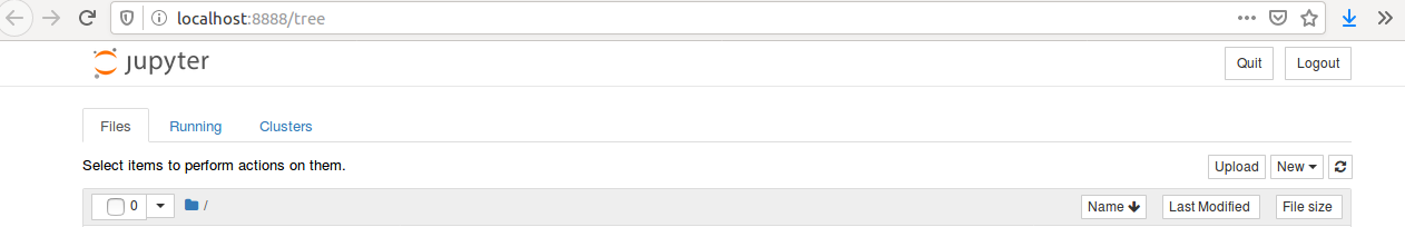
After running the Jupyter, it will start the server and pops up with dashboard above. This is written our localhost port, namely localhost:8888/tree. It is called a notebook server:
Let us go ahead and create a new notebook. In order to create a new notebook, we press New button on the top right side and choose Python 3. After clicking, you will get a completely blank notebook.
First thing we do is saving the file. Go to File --> Save as....
Notebooks have two different modes: command mode and edit mode.
Command mode allows you to perform actions like adding and deleting cells. You can put yourself in command mode by hitting Esc key. We get blue highlighted cell.
Edit mode allows you to edit the cells. You can put yourself in edit mode by hitting Enter key or just click into the cell. We get green highlighted cell.
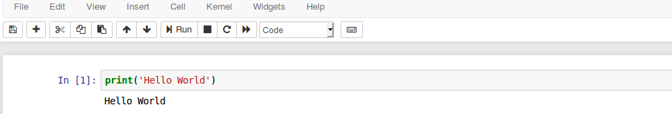
Let us add some simple codes. Click inside the cell and type print ('Hello World'). We can execute the code by clicking Run button on top menu.
We get:
If you want to create new cells, you can do it either with Shift + Enter or press + button. You get new cells below.
If you have a multiple operations in multiple cells, you can either run each cell by clicking Run button or run all cells by choosing in top menu Cell --> Run All.
Go to Help button and choose Keyboard Shortcuts. Scroll down and you can see all keyboard shortcuts that you can use while working with Jupyter.
DSP - digital signal processing
This is the online version of the provided PDFs in english language from the https://git.fh-aachen.de/group-uno/tutorial_it2 repository.
First tutorial
In this tutorial signals will be generated and combined with each other. The results are then visualized and can be listened to. Parts of this tutorial are inspired by Chapter 1 of the ThinkDSP book by Allen Downey https://github.com/AllenDowney/ThinkDSP.
This is about signals.
We use two modules:
thinkdspis a module that accompanies Think DSP and provides classes and functions for working with signals.thinkplotis a wrapper around matplotlib.
Before importing the modules, please install think modules by typing !pip install thinkx inside the cell.
Documentation of the thinkdsp module
from __future__ import print_function, division

%matplotlib inline

import thinkdsp
import thinkplot
import numpy as np

from ipywidgets import interact, interactive, fixed
import ipywidgets as widgets
from IPython.display import display
At the beginning of each Python script to use ThinkDSP, the following header must be executed. The future statement is intended to ease migration to future versions of Python that introduce incompatible changes to the language.
ipywidgets are interactive HTML widgets for Jupyter notebooks. Notebooks come alive when interactive widgets are used. Users gain control of their data and can visualize changes in the data.
%matplotlib inline - with this command, the output of plotting commands is displayed inline within the Jupyter notebook, directly below the code cell that produced it. The resulting plots will then also be stored in the notebook document.
Also display elements of iPython are needed by ThinkDSP to interact with the Jupyter Notebook.
First, a signal is to be generated is cosine. The signal should have a frequency of 1kHz and have an amplitude of 1.0:
cos_sig = thinkdsp.CosSignal(freq=1000, amp=1.0, offset=0)
The signal can then be displayed using the plot() method of the signal object:
cos_sig.plot()
We get:
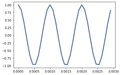
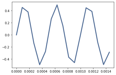
Three periods are always generated as standard. Subsequently, a sinusoidal signal is to be generated with twice the frequency and half the amplitude:
sin_sig = thinkdsp.SinSignal(freq=2000, amp=0.5, offset=0)
sin_sig.plot()
We get:
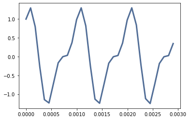
Both signals can be mixed, i.e. added using the + operator:
mix = cos_sig + sin_sig
Then mix can be displayed again with the plot() function:
mix.plot()
We get:
Waves
The generated mix signal cannot yet be listened to as it is a continuous function. This function must first be sampled so that it can be played back as an audio object. This is realized with the function make_wave():
wave = mix.make_wave()
Once the wave object is created you can listen to the wave with make_audio():
wave.make_audio()
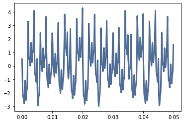
With TriangleSignal(), SquareSignal() and SawtoothSignal() further signals can be generated, which produce audible changes as a combination:
Tri_sig = thinkdsp.TriangleSignal(500)
Squ_sig = thinkdsp.SquareSignal(250)
Saw_sig = thinkdsp.SawtoothSignal(200)

mega_mix = Tri_sig + Squ_sig + Saw_sig + mix

new_wave = mega_mix.make_wave()

new_wave.make_audio()
new_wave.plot()
We get:

With the representation of new_wave the time axis is quite long with 1s, so that the signals are not visually distinguishable. With the function segment() parts of the wave can be cut out, e.g. only the first 50ms:
segment = new_wave.segment(duration=0.05)
segment.plot()
We get:
Now try to generate different waveforms, combine them and listen to the result.
Second tutorial
In this tutorial the signals are analyzed, e.g. by generating a spectrum. Subsequently, the signals are modified, e.g. with a low pass filter. The results are visualized and can also be listened to.
We start with the necessary import of the modules required by ThinkDSP:
from __future__ import print_function, division

%matplotlib inline

import thinkdsp
import thinkplot
import numpy as np

from ipywidgets import interact, interactive, fixed
import ipywidgets as widgets
from IPython.display import display
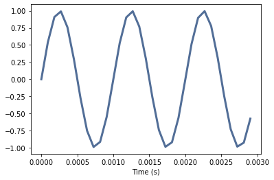
First we generate a sine signal with 1kHz frequency and an amplitude of 1.0. We insert a time axis with thinkplot.config():
sin_sig = thinkdsp.SinSignal(freq=1000, amp=1.0)

sin_sig.plot()
thinkplot.config(xlabel='Time (s)')
We get:
We can also display this signal in the frequency domain. For this we convert it into a wave object. Then we have to create the spectrum with make_spectrum(). The signal is transformed into the frequency domain:
sin_wave = sin_sig.make_wave()
sin_spectrum = sin_wave.make_spectrum()
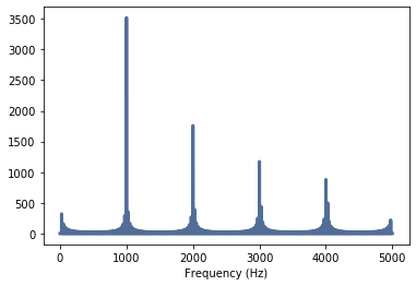
The spectrum can be displayed with the plot() method. The highest frequency to be displayed can also be specified here. Since we only expect frequencies in the range of 1kHz, we set the maximum frequency to 5kHz:
sin_spectrum.plot(high=5000)
thinkplot.config(xlabel='Frequency (Hz)')
We get:
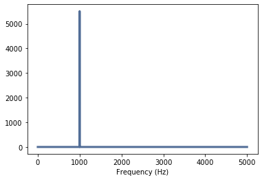
The result is quite clear: we see exactly one frequency at 1kHz that we have generated.
Now we want to generate another signal but this time with a different shape: a sawtooth:
saw_sig = thinkdsp.SawtoothSignal(freq=1000, amp=1.0)
saw_sig.plot()
thinkplot.config(xlabel='Time (s)')
We get:

We also want to display this signal in the frequency domain:
saw_wave = saw_sig.make_wave()
saw_spectrum = saw_wave.make_spectrum()
The spectrum is displayed again with the plot() method:
saw_spectrum.plot(high=5000)
thinkplot.config(xlabel='Frequency (Hz)')
We get:
The result is a little surprising, as frequencies outside 1kHz are clearly visible. A sawtooth has so-called harmonics or harmonic frequencies that occur exactly at the multiples of the fundamental frequency.
These harmonics can also be heard. To do this, we create audio objects from the two wave objects, which you can listen to. The function apodize() avoids clicking noises at the beginning and end of the audio object. First the sine wave:
sin_wave.apodize()
sin_wave.make_audio()
Now the sawtooth:
saw_wave.apodize()
saw_wave.make_audio()
Let us show you other signal shapes and also mixed signals to get an impression of the frequency contents.
Interactive interface
To allow a simple interaction without much input of different commands, the following Python code can be used. Please try different waveforms, sampling frequencies and input frequencies. The following example comes from the thinkDSP code:
def view_harmonics(freq, framerate):
    signal = thinkdsp.SawtoothSignal(freq)
    wave = signal.make_wave(duration=0.5, framerate=framerate)
    spectrum = wave.make_spectrum()
    spectrum.plot(color='blue')
    thinkplot.show(xlabel='frequency', ylabel='amplitude')

    display(wave.make_audio())

from ipywidgets import interact, interactive, fixed
import ipywidgets as widgets
slider1 = widgets.FloatSlider(min=100, max=10000, value=500, step=100)
slider2 = widgets.FloatSlider(min=1000, max=44000, value=10000, step=1000)
interact(view_harmonics, freq=slider1, framerate=slider2)
Third tutorial
In the third tutorial sampled signals are analyzed. The signals are already available as .wav files. These files can be simply recorded with a PC. The results are visualized and listened to again:
from __future__ import print_function, division

%matplotlib inline

import thinkdsp
import thinkplot
import numpy as np

from ipywidgets import interact, interactive, fixed
import ipywidgets as widgets
from IPython.display import display
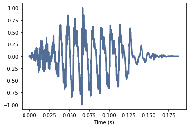
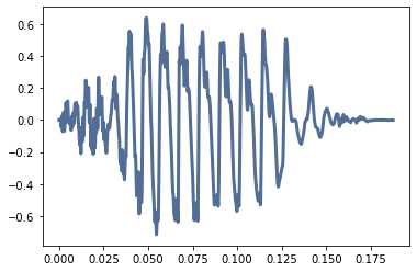
The function read_wave(‘FileName’) loads a wave object directly from an existing file. For practice a try-except block can be used to check the presence of the file. The file Ei01.wav is loaded by the following:
wave = thinkdsp.read_wave('Ei01.wav')
thinkplot.config(xlabel='Time (s)')
wave.plot()
We get:

This is a short ei sound that lasts ~200ms. With make_audio you can listen to the wave file or the generated wave object:
wave.make_audio()
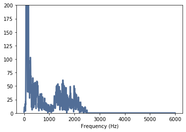
The essential frequencies of this sound can be determined by spectral analysis. Therefore a spectrum is generated and displayed with make_spectrum(). If no highest frequency is specified for the plot() function of the spectrum, the entire frequency range is displayed. Since the signal was sampled at 44.1kHz, the maximum frequency is ~22kHz:
spectrum = wave.make_spectrum()

spectrum.plot()
thinkplot.config(xlabel='Frequency (Hz)')
We get:
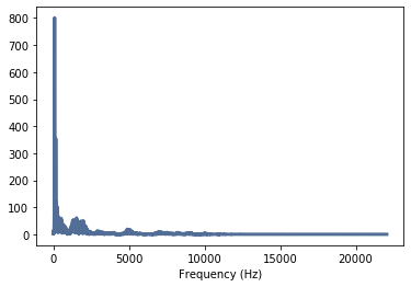
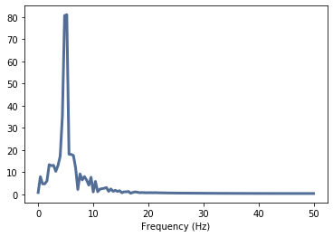
In the spectrum dominant frequencies up to approxrimately 10kHz are visible. However, the diagram is automatically scaled so that the lower amplitudes are hardly visible in the higher frequencies. With config() the y-axis is adjusted by specifying the value range:
spectrum.plot()
thinkplot.config(xlabel='Frequency (Hz)', ylim=[0, 200])
We get:
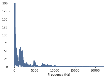
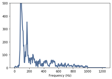
Now it is clearly visible that only frequencies up to ~10kHz occur and the main frequencies reach a little over 5kHz. A further adjustment of the display range produces the following spectral distribution:
spectrum.plot(6000)
thinkplot.config(xlabel='Frequency (Hz)', ylim=[0, 200])
We get:
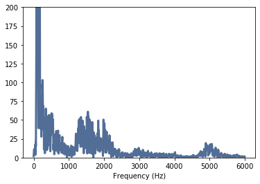
The signal can now be filtered e.g. with a low pass. First a low pass with a cut-off frequency of 2500Hz will be tested:
spectrum.low_pass(2500)
spectrum.plot(6000)
thinkplot.config(xlabel='Frequency (Hz)', ylim=[0, 200])
We get:
The limit frequencies are clearly visible in the spectrum. The filtered signal can be transformed back into the time domain (make_wave), so you can listen to the modified wave file. The function normalize() normalizes the amplitude to the interval +/-1.0 and apodize() avoids click noises at the beginning and end of the wave object:
filtered = spectrum.make_wave()
filtered.normalize()

filtered.apodize()
filtered.plot()
thinkplot.config(xlabel='Time (s)')
filtered.make_audio()
We get:
The audible difference between the filtered and unfiltered signal is not very clear. However, if you set the cutoff frequency to e.g. 1000 Hz, you will hear clear differences:
spectrum = wave.make_spectrum()
spectrum.low_pass(1000)
filtered = spectrum.make_wave()
filtered.normalize()
filtered.apodize()
filtered.plot()
thinkplot.config(xlabel='Time (s)')
filtered.make_audio()
We get:
This filtered wave file sounds very different. Also the spectrum looks different, because the higher frequencies were suppressed:
spectrum.plot(1250)
thinkplot.config(xlabel='Frequency (Hz)', ylim=[0, 500])
We get:
Then try creating and filtering your own wave files. Output the spectrum and decide where to place the filter boundary. Listen to the result.
Here is an interactive example from the ThinDSP Tutorial:
def filter_wave(wave, cutoff):
*#Selects a segment from the wave and filters it

Plots the spectrum and displays an Audio widget.
wave: Wave object
cutoff: frequency in Hz*

   spectrum = wave.make_spectrum()
   spectrum.plot(10000,color='0.7')
   spectrum.low_pass(cutoff)
   spectrum.plot(10000,color='#045a8d')
   thinkplot.show(xlabel='Frequency (Hz)', ylim=[0, 500])
   audio = spectrum.make_wave().make_audio()
   display(audio)

wave = thinkdsp.read_wave('Ei01.wav')
slider = widgets.IntSlider(min=100, max=10000, value=5000, step=50)
interact(filter_wave, wave=fixed(wave), cutoff=slider)
Fourth tutorial
The fourth tutorial shows how to generate digital filters with cutoff frequency and order. Furthermore thinkDSP is used for signal generation as well as SciPy. The interface between scipy signal and a module for digital signal processing within scipy is explained. A Digital Butterworth Filter is then applied to WAV objects. The Butterworth filter is a type of signal processing filter designed to have a frequency response as flat as possible in the passband.
We start with:
from __future__ import print_function, division
%matplotlib inline

import thinkdsp
import thinkplot
import numpy as np

from ipywidgets import interact, interactive, fixed
import ipywidgets as widgets
from IPython.display import display
In addition to the thinkDSP functions you need the scipy butter module for the Butterworth filter, the lfilter module for the digital filtering and the ** freqz module** for the frequency response of the filter. These are located in the signal module of scipy:
from scipy.signal import butter, lfilter, freqz
The filter parameters must now be specified. For the first attempts we choose a 6th-order filter. The order influences the steepness of the filter but also the Length of the filter (computing time). The sampling frequency must also be defined.
First is to be worked in the lower frequency range. The sampling frequency fs should be 100 Hz. It a low pass filter with a cutoff frequency of 10 Hz is to be generated. HeiSSt: all frequencies above 10Hz should be filtered out. All frequencies below should not be influenced by the filter. The Nyquist filter is still required for the design.Frequency. This is always half the sampling frequency fs/2:
# Filter requirements

order = 6
fs = 100.0       # sample rate, Hz
cutoff = 10.0    # desired cutoff frequency of the filter, Hz
nyq = 0.5 * fs
normal_cutoff = cutoff / nyq

# Generate Filter coefficients
b, a = butter(order, normal_cutoff, btype='low', analog=False)
After the design, i.e. the calculation of the filter coefficients, these can be displayed. There are a total of 14 values. These are the numerators and denominators of the coefficients of the IIR filter used: https://docs.scipy.org/doc/scipy/reference/generated/scipy.signal.butter.html#scipy.signal.butter
print (b, a)
We get:
[0.00034054 0.00204323 0.00510806 0.00681075 0.00510806 0.002043230.00034054]
[ 1.       -3.5794348  5.65866717  -4.96541523  2.52949491  -0.70527411  0.08375648]
The frequency response is calculated with freqz(). The parameter worN specifies the frequency resolution, i.e. how many frequencies are to be determined. Here is the documentation of freqz(): https://docs.scipy.org/doc/scipy/reference/generated/scipy.signal.freqz.html#scipy.signal.freqz
# Get the frequency response.
w, h = freqz(b, a, worN=8000)
Now the frequency response can be displayed. The frequencies - the array w - and the frequency responses - the array h - up to the Nyquist frequency (fs/2) are displayed. The frequencies are in rad/sample and h is a complex number, so a conversion has to be done:
# Plot the Frequency Response

plt.plot(0.5*fs*w/np.pi, np.abs(h), 'b')
plt.xlim(0, 0.5*fs)
plt.title("Lowpass Filter Frequency Response")
plt.xlabel('Frequency [Hz]')
plt.grid()
We get:
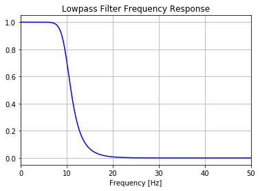
The frequency response shows a typical smooth Butterworth curve with a relatively low slope. Now it is necessary to generate signals similar to a real signal with noise. To do this, a sine signal with a frequency of 5Hz and normalized amplitude is mixed with a normally distributed noise with half the amplitude, i.e. added. The functions of thinkDSP are used for this purpose. Wave objects must be generated in order to to combine the noise with the useful signal.
sin_sig = thinkdsp.SinSignal(freq=5.0, amp=1.0, offset=0)
thinkdsp.random_seed(42)
noise_sig = thinkdsp.UncorrelatedGaussianNoise(amp=0.5)
sin_wave = sin_sig.make_wave(duration=2.5, framerate=100)
noise_wave = noise_sig.make_wave(duration=2.5, framerate=100)
noisy_wave = sin_wave + noise_wave

thinkplot.config(xlabel='Time (s)')
noisy_wave.plot()
We get:
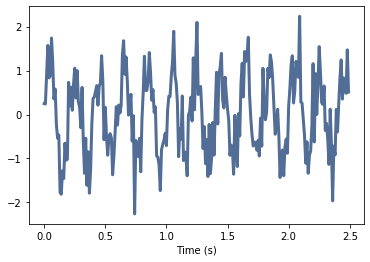
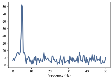
The signal is clearly noisy. The spectrum also shows that it has a main frequency of 5Hz, but that other signal components are distributed throughout the spectrum:
noisy_spec = noisy_wave.make_spectrum()
thinkplot.config(xlabel='Frequency (Hz)')
noisy_spec.plot()
We get:
The Butterworth filter requires a numpy array, which is part of the Wave object ys:
signal_data = noisy_wave.ys
To filter the signal lfilter() must be used. The application is quite simple, since only the filter coefficients and the filtered signal have to be passed.
To display the filtered signal, however, we have to generate the time axis with the numpy function linspace() from t=0 to t=2.5 s, i.e. the length of our generated signal. Additionally we need n-values for the representation, i.e. the length of the filtered signal. n is calculated with len(). Finally, the filtered signal can be plotted, where grid() is a grid in the plot is generated:
T = noisy_wave.duration
n = len(noisy_wave.ys)
t = np.linspace(0, T, n, endpoint=False)

# Filter the data, and plot both the original and filtered signals.
y = lfilter(b, a, signal_data)

plt.plot(t, y, 'g-', linewidth=2, label='filtered data')
plt.xlabel('Time [sec]')
plt.grid()
We get:
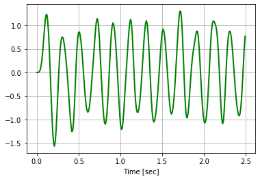
The signal can be almost completely filtered out of the noisy signal. For verification, the signal is transformed into the frequency domain and evaluated.
filtered = thinkdsp.Wave(y,framerate=fs)
filt_spec = filtered.make_spectrum()
thinkplot.config(xlabel='Frequency (Hz)')
filt_spec.plot()
We get:
Now a Butterworth filter is to be applied to real, sampled signals. The following two functions simplify the application:
def butter_lowpass(cutoff, fs, order=5):
    nyq = 0.5 * fs
    normal_cutoff = cutoff / nyq
    b, a = butter(order, normal_cutoff, btype='low', analog=False)
    return b, a

def butter_lowpass_filter(data, cutoff, fs, order=5):
    b, a = butter_lowpass(cutoff, fs, order=order)
    y = lfilter(b, a, data)
    return y
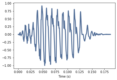
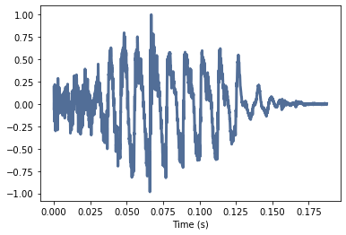
First, the well-known “Ei01.wav” is to be filtered:
wave = thinkdsp.read_wave('Ei01.wav')
thinkplot.config(xlabel='Time (s)')
wave.plot()
wave.make_audio()
We get:
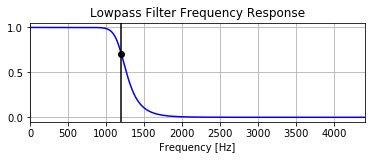
We define the parameters for the filter. The Butterworth should be steeper this time. Therefore we increase the order. The sampling rate gets from the wave object from the property framerate. The cut-off frequency is set to 1200Hz. To visualize the attenuation of the filter a marker is used at the cutoff frequency:
# Filter requirements.
order = 10
fs = wave.framerate     # sample rate, Hz
cutoff = 1200.0         # desired cutoff frequency of the filter, Hz

# Get the filter coefficients so we can check its frequency response.
b, a = butter_lowpass(cutoff, fs, order)

# Plot the frequency response.
w, h = freqz(b, a, worN=8000)
plt.subplot(2, 1, 1)
plt.plot(0.5*fs*w/np.pi, np.abs(h), 'b')
plt.plot(cutoff, 0.5*np.sqrt(2), 'ko')
plt.axvline(cutoff, color='k')
plt.xlim(0, 0.1*fs)
plt.title("Lowpass Filter Frequency Response")
plt.xlabel('Frequency [Hz]')
plt.grid()
We get:
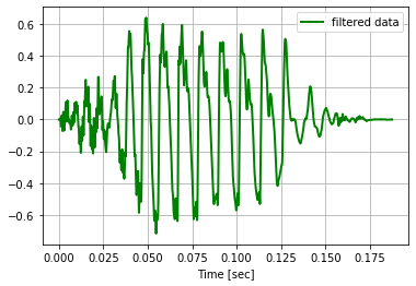
data = wave.ys

T = wave.duration
n = len(wave.ys)
t = np.linspace(0, T, n, endpoint=False)

# Filter the data, and plot both the original and filtered signals

y = butter_lowpass_filter(wave.ys, cutoff, fs, order)

# plt.plot(t, wave.ys, 'b-', label='data')

plt.plot(t, y, 'g-', linewidth=2, label='filtered data')
plt.xlabel('Time [sec]')
plt.grid()
plt.legend()

plt.show()
We get:
filtered = thinkdsp.Wave(y,framerate=fs)

filtered.plot()
filtered.make_audio()
We get:
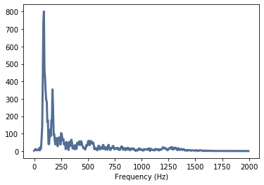
filt_spec = filtered.make_spectrum()
thinkplot.config(xlabel='Frequency (Hz)')
filt_spec.plot(high=2000)
We get: